BLACKWOOD TOASTED BOURBON
Brand Foundation | Brand Narrative & Naming | Brand Identity | Package Design | Photography
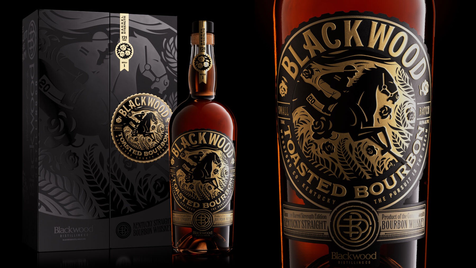
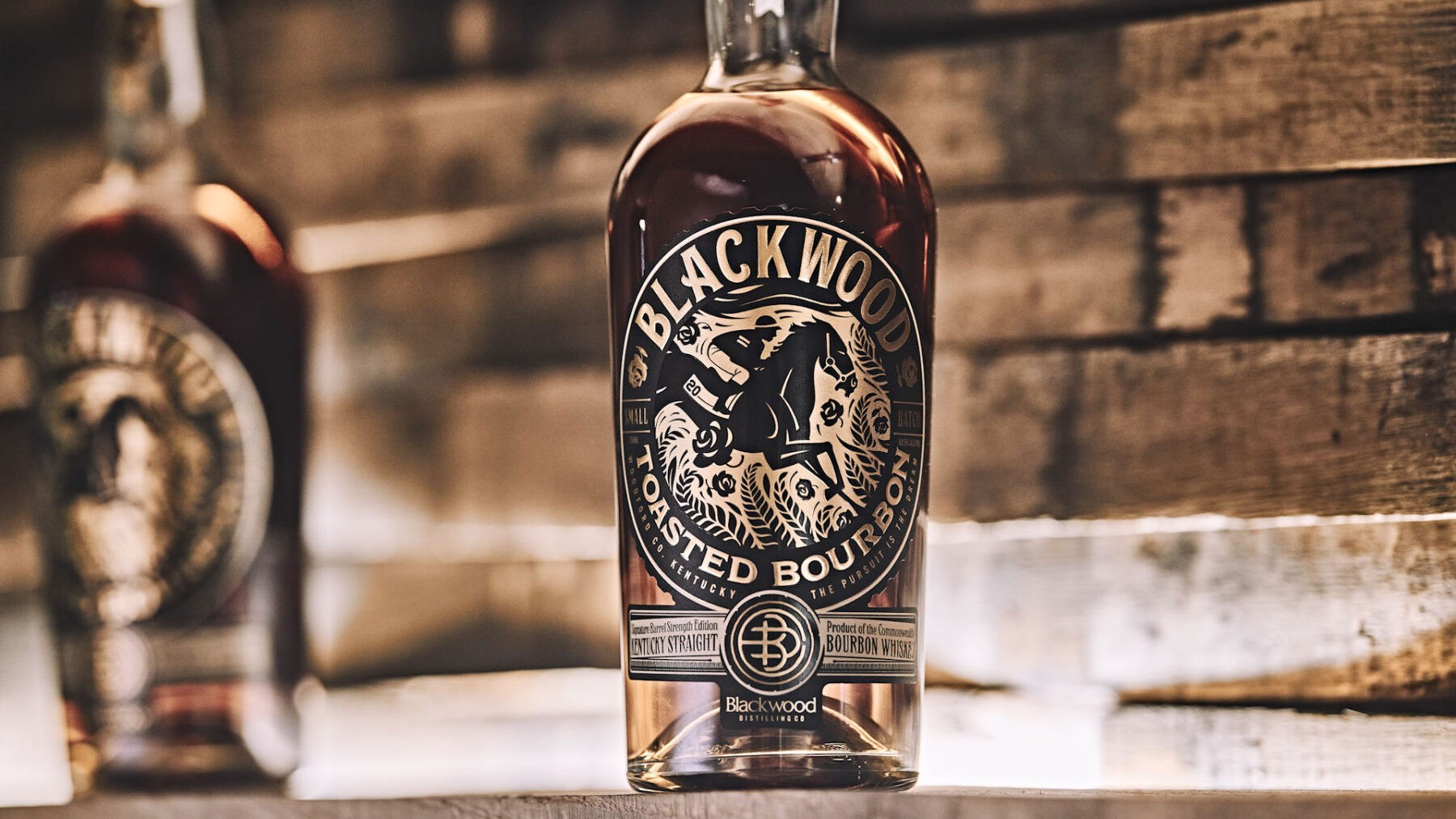
Blackwood Toasted Bourbon an exceptional, high-end toasted bourbon with a label design and packaging that delivers on the same level.
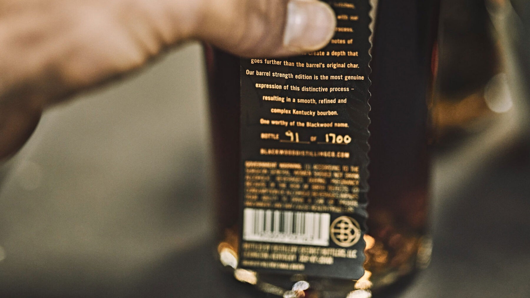
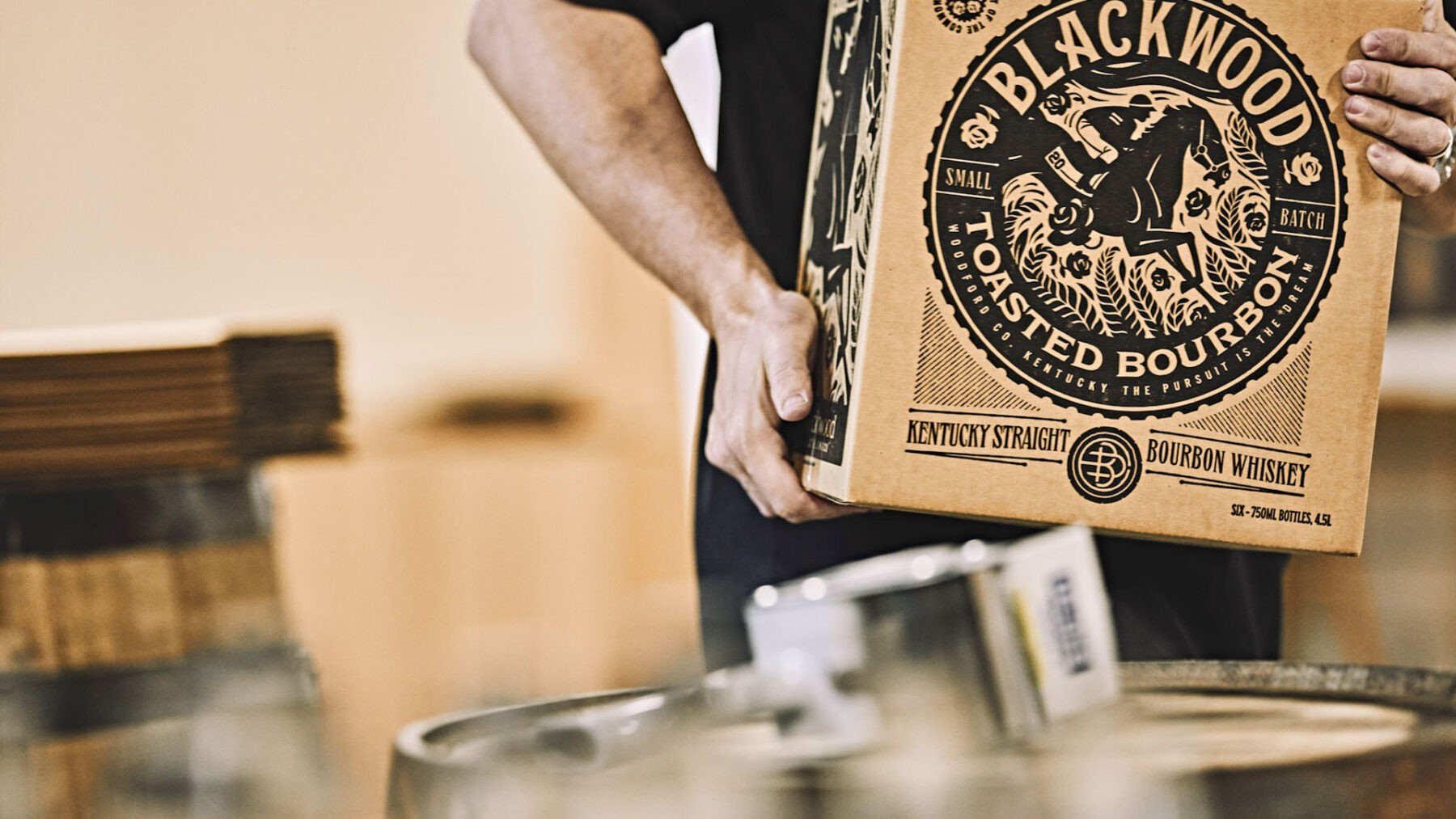
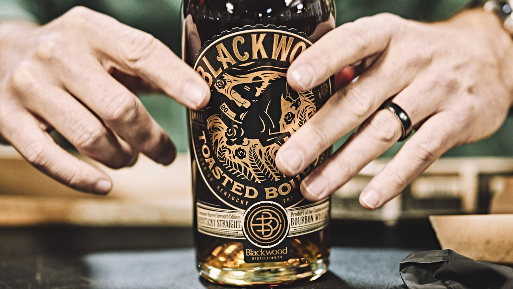
Neltner Small Batch’s packaging solution displays a refined elegance that is rich in texture. The regal palette of gold and black is impressively bold. The label is a balance of striking visual storytelling with layers of delicate intricacies. An original illustration commands center stage with its precision — capturing the Thoroughbred’s inherent beauty and forward motion. All emphasized through an exquisite use of varnishes and embossing.
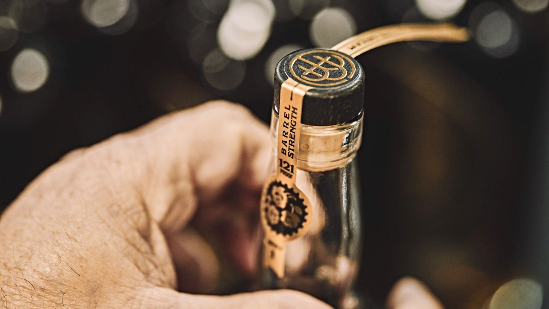
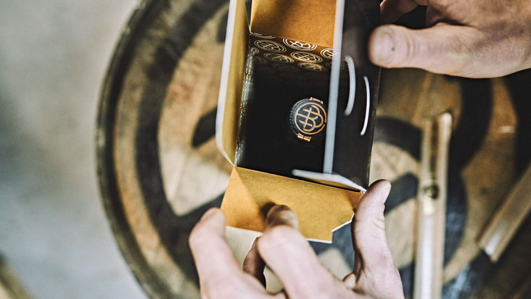
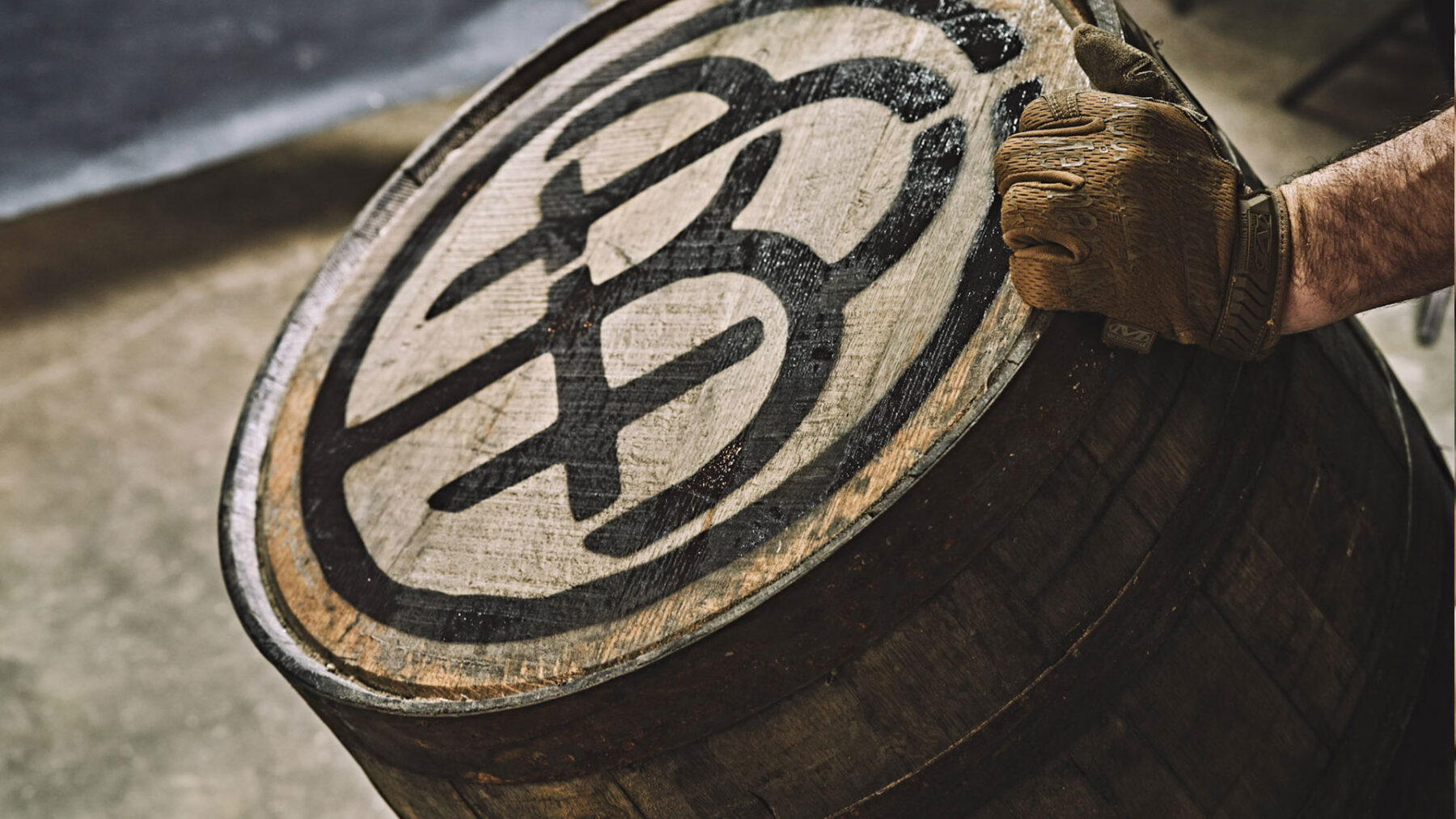
The product experience is further heightened with a custom box, showcasing varnishes that delight the visual and textural senses. Stunning details allow for the unveiling of the bottle. Neltner’s layered and detailed branding also includes a Blackwood merchant’s mark (a modern take on an ancient artisan marking to authenticate their brand in early blacksmithing) that crowns the bottle top.
The Batch:
Creative Director – Keith Neltner
Brand Leader – Andi Bussard
Writer – Jeff Chambers
Illustrators – Tom Post, Keith Neltner
Photography – Brian Steege
Designer – Keith Neltner
3D Artist – Polymath

